The Plan
26 Apr 2015- What the heck is D3.js?!
- Resources
- D3 anatomy
- Coding cheatsheet
- I <3 bar charts
D3.js was developed by Mike Bostock as part of his PhD work at the Stanford Vis Group. He’s currently employed by the New York Times to do their funky visualisations and infographics and you can find a list of them on his personal website as well a list of his open source projects.
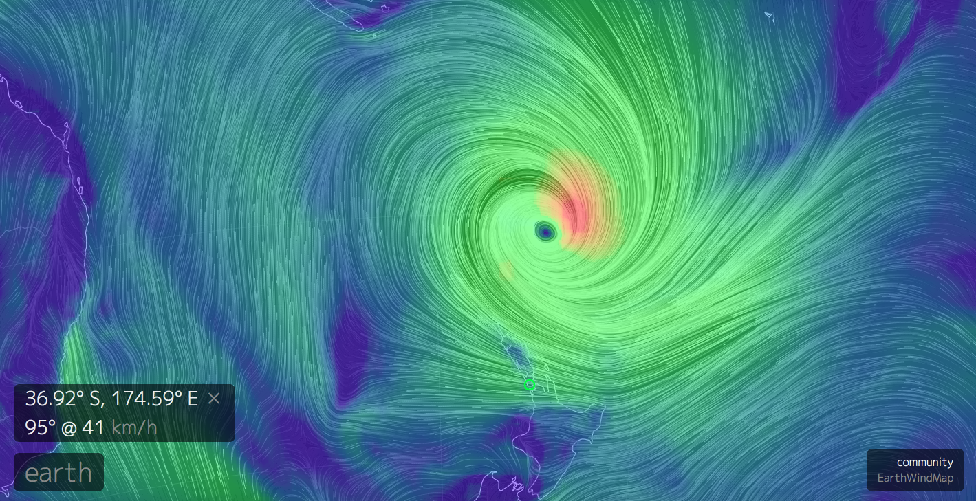
Since the D3.js library has reached maturity, it’s been used far and wide for everything from basic charts to supercomputer backed simulations of earth.
At it’s core, D3.js utilises HTML, SVG and CSS and focuses on manipulating data. It also supports all modern browsers including Internet Explorer 9+.
To get D3.js up and running on your page. All you need to do is copy this link
<script src="http://d3js.org/d3.v3.min.js" charset="utf-8"></script>
between the <head> elements of your <html> page and start manipulating your data.
 http://earth.nullschool.net/
Because your D3 code will live within a HTML document, the basic structure tends to follow a traditional pattern:
<html>
  <head>
    <style></style>
    <script src="http://d3js.org/d3.v3.min.js" charset="utf-8">
    </script>
  </head>
  <body>
    <div id="vis"></div>
    <script></script>
  </body>
</html>
Although naturally there are many schools of thought and variations on this structure, so being able to pick which bits you need to hack and which bits to leave alone (initially) often takes experimentation.

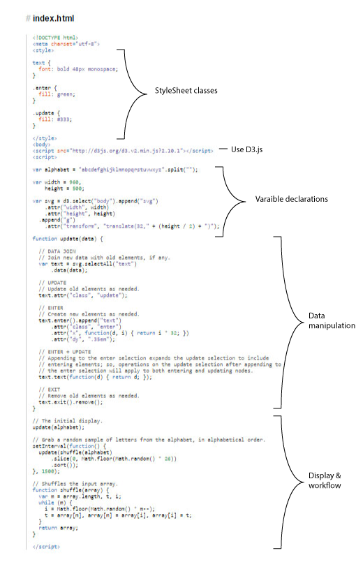
Example code taken from General Update Pattern, I
The easiest way I’ve found to digest a D3 example is to pick out the familiar bits and add comments (on the assumption that there aren’t any there to begin with) - comments in JavaScript look like this // Single-line comment and like this in HTML <!-- Single or multi-line comment --> and like this in CSS \* Comment *\
Here are a few aspects of HTML, CSS, JavaScript, SVG and general code-jargon that may be of assistance, even if it’s just helping with terms and concepts to Google.
&name; version should be sufficient in most cases)type.<p id="demo" style="text-align:center;color:red">Inner text.</p>.<div> tags to ‘place’ the D3 elements on the page although function wise, they are quite limited.<head> element, as a linked style sheet or inline as an attribute.| Selector | Selects |
|---|---|
| $("#bob") | The element with id="bob" |
| $(".pink") | All elements with class="pink" |
| $(".pink,.blue") | All elements with class="pink" or class="blue" |
| $("div") | All <div> elements |
| $("div,p,svg") | All <div>, <p> and <svg> elements |
text-anchor: middle to centre text in an SVG text element (start and end are the other options).Number("3.14") or (3.14).toString() or x.toString().Figuring out the Bar Charts examples (there are 3 of them) is a good place to start as they do a pretty good job of taking you through the basics and highlighting the differences between creating charts manually, and harnessing the power of D3.js.
Follow the example and then fire up the CodePen template which provides you with a browser based playground with which to experiment and helpfully separates the code into it’s three component elements, the HTML, the CSS and the JavaScript.
In the CSS:
In the JavaScript:
d3.scale.linear?Now that you’ve had a chance to play with the bar chart example(s) I thought I would point you in the direction of some futher reading and a bit of code that may help with the Have a play! section.
In the CSS:
Both of these involve changing the CSS portion of the code. The padding and margin properties specifically. In terms of colour options there are a great many web resources that can help with the selection of hex (i.e. #0000FF) and named colours (i.e. steelblue), but one such resource I’m quite fond of is Adobe Color CC which allows you to create colour schemes (which can really help when creating visualisations). Click to ‘edit’ any of the colour schemes and it will give you the hex value for each colour.
In the JavaScript:
This is primarily contolled by the .range() JavaScript method (which in this case dictates how much space the x-axis has). You can also control the graph’s height by changing the padding and margin CSS properties.
d3.scale.linear?Lots according to the API specification, but have a look at how the shape of the graph changes if you change d3.scale.linear to d3.scale.pow and d3.scale.sqrt. Changing which scale is used changes how the .domain() maps to the .range(), an important consideration.
D3.js has a built in filter method that allows selections to be limited to items that pass a certain condition. So in this case, under the .enter().append("div") line in the JavaScript, I added .filter(function(d) { return d > 15}) which limits further processing (in this case styling and the addition of text) to only those elements whose value is greater than 15. Because of the way the code in the example is structured, the graph does leave some whitespace in expectation of these bars being present.
There are quite a few ways which this could be achieved. I opted to remove the background-color: steelblue; line from the CSS, and add .style("background-color", function(d) {return (d > 15 ? "green" : "red")}) to the JavaScript under the other .style() method. In my function I’ve used what is called a tenary operator which is a short-hand way of encapulating a simple if-then-else statement, basically (thing-to-test ? true-value : false-value). You’ll see these quite a bit in D3.js examples as D3 relies heavily on inline functions which can get a bit of a readability bump from these short-hand forms.
Here’s what mine looked like (adjusted to d > 14 so you can see the colouring):
And the code for it:
<html>
<head>
<style>
.chart div {
  font: 10px sans-serif;
  text-align: right;
  padding: 6px;
  margin: 2px;
  color: white;
}
</style>
</head>
<body>
<script src="http://d3js.org/d3.v3.min.js"  charset="utf-8"></script>
<div class="chart"></div>
<script>
var data = [4, 8, 15, 16, 23, 42];
var x = d3.scale.linear()
          .domain([0, d3.max(data)])
          .range([0, 420]);
d3.select(".chart")
  .selectAll("div")
  .data(data)
  .enter().append("div")
  .filter(function(d) { return d > 14})
  .style("width", function(d) { return x(d) + "px"; })
  .style("background-color",
          function(d) {return (d > 15 ? "green" : "red")})
  .text(function(d) { return d; });
</script>
</body>
</html>